How To Choose A Personalised Photo Calendar
A practical step-by-step guide to how to choose a personalised photo calendar, including preparation, instructions, common issues, tips, and next steps.
How To Choose A Personalised Photo Calendar
A personalised photo calendar turns your own pictures into a useful, emotional object you look at every day. This guide helps you choose one without wasted effort or disappointment. You will learn to set a realistic purpose, gather and prepare photos, pick a sensible size and layout, and review the final product before ordering. The advice stays practical, avoids brand names, and gives you specific checks at each stage so the calendar fits your wall, your budget, and the story you want to tell.
Fast Answer
- Decide the calendar's main job first, such as a family gift, a desk planner, or a memory display, because that choice shapes size, binding, and photo count before you open any design tool.
- Shortlist two or three photo files from each month you care about, check them at full size for blur or closed eyes, and write a one-line caption idea before you begin arranging pages.
Before You Start
- Write a short purpose statement: who receives the calendar, where it will hang, and whether it is mostly for planning, decoration, or memory keeping.
- Create a folder on your device named for this calendar and copy only the best candidate photos into it, so you are not scrolling through years of images during design.
- Note the wall or desk space available by measuring height and width in your chosen unit, and leave a little breathing room around the final size you consider.
- List any dates that matter, such as birthdays or trips, and decide whether you want those marked on the calendar pages or kept only in the photos.
Step-by-Step Instructions
Define the calendar's purpose and audience
Before you browse any design options, write one sentence that states who the calendar is for and what it should do. For example, a calendar for a parent might focus on family photos and large date boxes for appointments, while one for your own desk might rotate through travel scenes and keep the date area smaller. This sentence becomes your filter: if a size or style does not serve that purpose, you can skip it without regret. Next to the sentence, note where the calendar will live, because a busy kitchen wall and a quiet office shelf call for different visual weight. Also decide whether the calendar is a one-time gift or something you will update each year. A yearly project favors simple layouts and reusable photo habits, while a single gift can justify more elaborate page designs. Write these notes down and keep them visible while you shop. This step takes ten minutes and prevents hours of comparing features you do not need.
Gather and prepare your candidate photos early
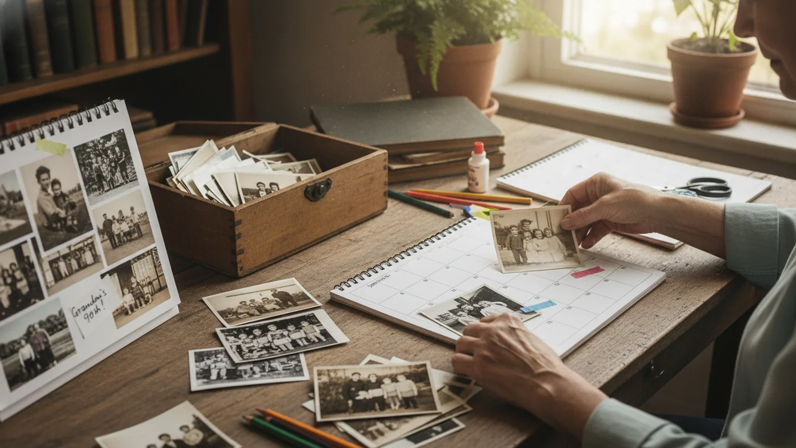
Collect photos from at least the last twelve months, but do not try to include everything. Open your photo library and create a new folder for this project. As you scroll, add only images that are sharp, well lit, and emotionally strong. Aim for three to five candidates per month or per theme, which gives you room to change your mind later. Once the folder is full, review each image at full size on a large screen. Delete any with motion blur, heavy shadows across faces, or distracting backgrounds that pull attention from the subject. Then rename the keepers with month and subject, such as march-hike or july-cousins, so you can find them quickly in the design tool. Check the file format and orientation, because a tall photo may not fit a wide page slot without awkward cropping. Finally, back up the folder in a second location before you start uploading, since losing your selection near the end is frustrating.
Choose size, binding, and paper with your space in mind
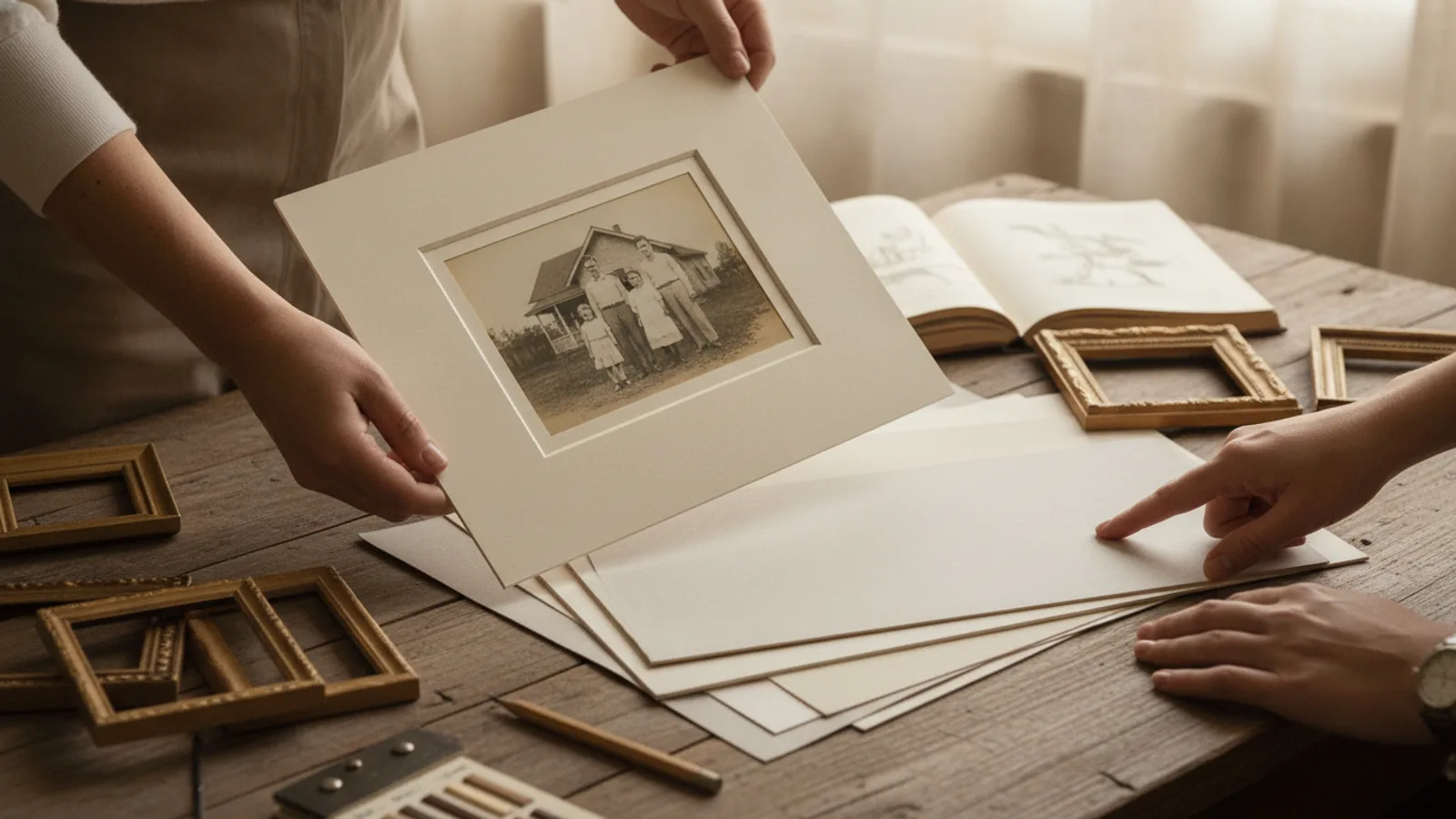
Measure the space where the calendar will hang or sit, then compare that measurement to common size categories without relying on exact numbers from any one seller. A larger wall calendar gives photos more impact but needs more empty wall and a stronger hook. A smaller desk calendar keeps dates close but limits photo area. Next, consider binding: a spiral or wire binding lets pages lie flat and flip easily, while a glued or stapled edge may feel more like a book but can resist staying open. If the calendar will be handled often, look for a binding that protects page edges. Paper choice matters too; thicker pages resist show-through and feel more substantial, while thinner pages keep the calendar light and lower in cost. Hold a sample or read the product description for paper weight and finish, then ask yourself whether the surface will glare under your lighting. Check the hanging hardware included, because some calendars need a separate hook or stand that is not obvious from the main photo.
Match the layout to how the calendar will be used
Layout decides whether your calendar feels calm or cluttered. Start by counting how many photo slots appear on a typical page and how large each slot is relative to the date grid. A planning calendar needs generous white space for writing, so choose a layout with a small photo and a large, clear date area. A memory calendar can use a full-page photo with dates tucked into a corner. Next, look at how weekends are treated, whether holidays are preprinted, and whether the week starts on the day you expect. These details affect daily use more than the cover design. Then check the text size on the date numbers and month names, because a beautiful photo is useless if you cannot read the date from across the room. If you plan to add your own notes, confirm the paper accepts pen without smudging. Also review whether the layout repeats the same photo shape every month or varies it; repetition can feel orderly, while variety can feel more like a story. Pick the layout that matches your earlier purpose sentence, not the one with the most decorative elements.
Arrange photos and text to tell a clear story
Now place your chosen photos into the layout, month by month. Begin with the cover, because it sets expectations and is the first thing anyone sees. Choose an image that works at small size and does not rely on fine detail. Then work through the months in order, assigning each photo a clear reason to be there, such as a birthday month, a season, or a recurring family event. Keep faces away from the binding edge and away from the area where the date grid will sit, because those zones can hide or crowd important parts of the image. Add captions only where they add information or warmth, and keep them short so they do not compete with the photo. Use the same font and text size for captions throughout to create a steady rhythm. After placing everything, review the full calendar in a slide show or page view, watching for repeated colors, duplicate poses, or a month that feels empty. If a page feels weak, swap in another candidate from your folder rather than stretching a poor image. This is also the moment to mark special dates if the design allows it.
Proof the final product and confirm before ordering
Proofing is the step that saves you from a year of regret. First, view every page at full size, one at a time, and check for closed eyes, odd expressions, motion blur, and objects growing out of heads. Then read every piece of text backwards, word by word, to catch spelling and date errors that normal reading skips. Confirm that all twelve months are present and in the correct order, and that the year is right on every page. Next, check the crop: look for faces or important details close to the edge that might be trimmed during production. If the design tool offers a preview of bleed or safe areas, use it and move anything important inward. Also review the cover, binding, and any optional extras one last time against your original purpose notes. When you are satisfied, save or export a final copy of your design so you can reorder or make a similar calendar later. Finally, read the seller's return and reprint policy before you pay, because personalized items often have limited options after printing begins.
Quick Reference
| Situation | Action | Why it helps |
|---|---|---|
| You want a calendar that family members will actually write on every day. | Choose a layout with a large date grid, generous white space, and a smaller photo area, then test readability by viewing a sample page from a few feet away. | A planning calendar fails when there is no room to write or the numbers are too small, so prioritizing the date area over photo size keeps the calendar useful all year. |
| You are making a gift and want it to feel personal without being cluttered. | Limit each page to one strong photo or a small, consistent group, add short captions only where they add meaning, and keep the same font and text size throughout. | Personal does not mean crowded; a restrained layout lets each chosen memory stand out and makes the calendar easier to enjoy at a glance. |
| You have hundreds of photos and cannot decide which to include. | Set a rule before you start, such as one photo per month plus a cover, and create a shortlist folder of three candidates per slot so you can swap without reopening your whole library. | A clear limit turns an overwhelming archive into a manageable set of choices and prevents long delays that often end in rushed, less careful design. |
Common Issues
- Photos look sharp on a phone but blurry or pixelated on the calendar page.: View each image at full size on the largest screen you have and zoom in on faces and fine details. If it looks soft or blocky when enlarged, replace it with a higher-quality original rather than relying on an edited or compressed copy.
- The date area is too small to write on comfortably.: Compare several layouts specifically for the size of the daily boxes and the amount of white space around them. Choose one with a larger date grid and a smaller photo, even if the photo effect is less dramatic, because daily use matters more than a single decorative page.
- Important parts of a photo are cut off by the page edge or binding.: Use the design tool's safe-area or bleed preview if available, and move faces and key details inward from the edges. Avoid placing text near the binding, and choose a layout with a wider margin when you cannot reposition the image without losing its meaning.
Advanced Tips
- Build a small reusable template in your design tool with your preferred fonts, caption size, and margin settings, then apply it to next year's calendar to save time while keeping a consistent look.
- Create a color story by choosing one dominant and one accent color from your photos, then use that accent only for captions or small design touches so the pages feel related without becoming repetitive.
- Order a single proof or view a full digital preview before committing to multiple copies, because a small test run reveals printing, cropping, and color differences that a screen preview cannot show.
Final Checklist
- Confirm that every page has been viewed at full size and that no faces, text, or key details fall outside the safe area.
- Verify that all twelve months appear in order, the year is correct, and any special dates are marked where you intended.
- Check that the chosen size, binding, and paper match your measured space and the calendar's main purpose.
- Save a final copy of your design and read the seller's policy for returns or reprints before completing the order.
FAQ
How many photos should I include in a personalised calendar?
There is no single right number, but a calm and useful calendar usually works best with one main photo per month plus a cover image. If your layout has small accent slots, you can add a few detail shots, but keep the total low enough that each image still feels intentional. A good test is to ask whether you would stop to look at each photo if you saw the page on a wall. If a picture is only there to fill space, remove it and let the remaining images breathe. Starting with a limit also makes your selection faster and reduces the chance that you rush the final arrangement.
What should I check before uploading my photos to a calendar maker?
Check three things: quality, orientation, and location. For quality, view each image at full size and remove any that are blurry, poorly lit, or heavily compressed. For orientation, confirm whether each slot needs a horizontal or vertical image and prepare both versions of important scenes. For location, create a dedicated folder with your final choices so you do not accidentally upload the wrong file. Also make sure the folder is backed up, and confirm the file format is one the design tool accepts. Doing this before you start the layout saves you from rebuilding pages later and helps you order with confidence.
How do I avoid a calendar that looks cluttered or hard to read?
Focus on white space and contrast rather than adding more decoration. Choose a layout with clear margins and a date grid that is large enough to read from a normal distance. Limit each page to one main image or a small, consistent group, and use the same font and text size for all captions. Avoid placing text over busy parts of a photo, and keep faces away from the binding and page edges. Before ordering, view the full calendar at page size and step back to test readability. If a page feels busy, remove one element rather than shrinking everything to fit, because a simpler page is almost always easier to enjoy all year.