How To Choose Photo Book Paper Finish
A practical step-by-step guide to how to choose photo book paper finish, including preparation, instructions, common issues, tips, and next steps.

How To Choose Photo Book Paper Finish
Choosing a paper finish for a photo book changes how every image feels in the hand and under the light. This guide walks you through matching finish to your subject, your viewing habits, and the way your book will be stored, so you can order with confidence instead of guessing. You will compare matte, glossy, satin, and textured surfaces using small proof prints, learn how lighting and fingerprints affect each option, and confirm your choice with the printer before the final file is sent.
Fast Answer
- Order a small proof or sample pack first so you can compare finishes on your own photos under the light where the book will live.
- Match the finish to the mood: glossy for punch and detail, matte for softness and low glare, satin for a balanced middle ground.
Before You Start
- Gather a handful of your actual images that represent the range in the book, including dark shadows, bright skies, skin tones, and fine texture detail.
- Decide where the book will be viewed most often and note the light sources there, such as a window, a warm lamp, or a dim shelf.
- Ask the printer which paper stocks and finishes are available for the size and page count you plan to order, and request a sample or swatch.
- Set a simple budget for the project that includes a test print, since a small proof is cheaper than reprinting a full book with the wrong surface.
Step-by-Step Instructions
Study Your Images and Their Mood
Start by spreading out a representative set of your photos and looking at what they have in common. Are they high-contrast landscapes with deep shadows and bright highlights, or soft portraits with gentle skin tones? Write down three words that describe the mood you want, such as crisp, warm, or quiet. This matters because a finish is not neutral; it either amplifies contrast or softens it. Glossy surfaces tend to deepen blacks and make colors feel more vivid, while matte surfaces absorb light and create a gentler, more painterly look. As a practical check, view the same five images at full size on your screen and note which ones you would want to feel sharp and which you would want to feel calm. That short list becomes your reference when comparing physical samples later, and it keeps the decision tied to your actual work instead of abstract preference.
Compare Samples Under Real Light
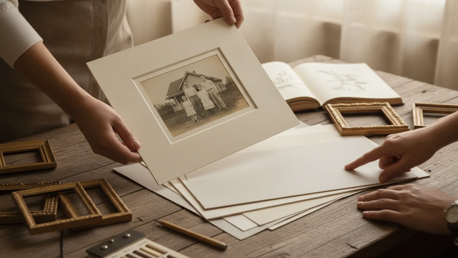
Order a sample pack or a single small proof from your printer, then examine it in the places where the finished book will actually be used. Hold each sample near a window in daylight, under a warm indoor lamp, and in a dim corner. Tilt the sheet slowly and watch for reflections, glare, and color shift. This is the step where most surprises appear, because a finish that looks rich in bright daylight can turn into a mirror under a ceiling light. Use a simple check: stand where you would normally sit to read the book, hold the sample at reading angle, and ask whether you can see the light source reflecting back at you. If you can, that finish may fight the reader's comfort. Note your observations on paper so you can compare them later without relying on memory.
Weigh Handling and Fingerprints
Think about who will touch the book and how often. Glossy and semi-gloss surfaces show fingerprints, smudges, and dust more readily, which matters for a book that children will flip through or that guests will handle at a gathering. Matte and textured surfaces hide marks better and feel drier to the touch, but they can scuff or burnish where fingers repeatedly rub. Pick up each sample and handle it the way a reader would: turn a page, press a thumb near the corner, and check the surface afterward. A practical test is to handle the sample with slightly damp or naturally oily hands, then hold it at an angle to the light. If visible marks bother you, lean toward a matte or lightly textured finish, or plan to store the book in a sleeve when it is not being viewed.
Match Finish to Book Type and Use
Different kinds of photo books call for different surfaces. A wedding or portrait album that will be displayed on a table often benefits from a satin or luster finish that balances color depth with reduced glare. A travel or landscape book with dramatic skies may suit glossy or metallic-look papers that emphasize contrast and detail. A baby book or a journal-style memory book usually feels better on matte or textured paper that invites touch and hides fingerprints. Consider the page count and thickness too, because very thick glossy pages can feel stiff and reflect light across a two-page spread, while thinner matte pages may show slight shadowing from the reverse side. Check how your chosen finish behaves on a double-page spread by taping two samples together and viewing them as one image. This reveals glare and seam issues before you commit to the whole book.
Confirm Details With the Printer
Before you place the final order, contact the printer and confirm the exact paper stock, weight, and finish name for your chosen size. Ask whether the finish you selected is available for your page count and binding style, and whether any coating is applied to one side or both. Request a written summary or check the order confirmation carefully, because similar-sounding names can describe different surfaces. Ask specifically how the finish responds to lamination, varnish, or UV coating, since an added layer can change the surface you thought you chose. Also ask what the printer recommends for books that will be handled often or stored in humid rooms. Write down the answers and compare them to your sample. If the description does not match what you felt in your hand, ask for another sample before approving the run, because the physical sample is the most reliable reference you have.
Run a Final Proof and Approve
After narrowing your choice, order one complete proof of the book or at least a multi-page test using the final files. Review it page by page in the lighting where the book will live, checking skin tones, shadow detail, and how bright whites behave. Look for glare across large images and for any surface marks that appear during normal handling. Compare the proof against your earlier notes and your original mood words. If something feels off, decide whether the issue is the finish, the paper weight, or the image itself, because each has a different fix. A practical final check is to place the proof on the shelf or table where the finished book will sit, leave it for a day, and pick it up again with fresh eyes. Approve only when the surface feels right in your hand and the images read clearly without strain. Then place the full order with the confirmed stock details.
Quick Reference
| Situation | Action | Why it helps |
|---|---|---|
| Your photos are high-contrast landscapes with deep shadows and bright skies. | Choose a glossy or luster finish and review a sample under daylight and indoor light to confirm blacks stay rich without mirror-like glare. | Glossy surfaces deepen dark tones and increase apparent sharpness, which suits dramatic scenes, but they also reflect light sources and can hide detail behind glare. |
| The book will be handled often by children or guests at gatherings. | Select a matte or lightly textured finish and plan to store the book in a protective sleeve when it is not being viewed. | Matte and textured surfaces resist visible fingerprints and smudges better than glossy ones, so the book stays presentable through repeated handling. |
| You want a balanced look for a portrait album displayed on a table. | Ask the printer for a satin or luster sample, then view it at reading angle in the room where the album will sit before ordering the full run. | Satin finishes reduce glare compared with glossy paper while keeping more color depth than plain matte, which suits faces and soft light. |
Common Issues
- The printed colors look duller or darker than they did on your screen.: Compare the proof under the same light where you edited the images, then ask the printer how their process handles color and whether a different finish would preserve brightness better. Screens emit light while paper reflects it, so some shift is normal, and a proof is the only reliable reference.
- Glare from a lamp or window washes out parts of a large image.: Move the sample or proof to the reading position and change your angle to confirm the problem, then switch to a matte or satin finish if the glare remains. You can also ask whether the printer offers a low-glare coating, since surface reflection is the main cause of this issue.
- Fingerprints and smudges appear quickly on the surface.: Handle the proof with clean, dry hands and check it under angled light to see the marks, then choose a matte or textured stock for books that will be touched often. Store the finished book in a sleeve and remind readers to hold pages by their edges.
Advanced Tips
- Ask the printer how their finish interacts with their ink or toner process, because the same paper name can look different depending on the printing method used.
- Request a sample with a dark image and a bright white area side by side, since that combination reveals how a finish handles shadows and highlights at once.
- Consider the book's cover separately from its inner pages, because a sturdy matte cover with a satin interior can balance durability with image quality.
Final Checklist
- I have compared at least two finishes using my own images, not just a generic sample.
- I have viewed the samples under the same lighting where the finished book will be kept and used.
- I have confirmed the exact stock name, weight, and finish with the printer in writing before ordering.
- I have approved a complete proof or multi-page test with the final files before the full run.
FAQ
Is glossy paper always better for color photos?
Glossy paper often makes colors appear more vivid and deepens blacks, which can suit dramatic or high-contrast images. However, it also reflects light and shows fingerprints more easily, so it may not be the best choice for a book that will be handled often or displayed near a bright window. The right answer depends on your images, your lighting, and how the book will be used. Compare a glossy and a matte sample with your own photos before deciding.
How do I know which finish will look best in my home?
Take your samples into the room where the book will live and view them at the angle you would normally use when reading. Check them in daylight, under indoor lamps, and in dim light, then note where glare or dullness appears. This simple test is more reliable than any online preview because it uses the real light and the real viewing position. If a finish looks comfortable in all three conditions, it is likely a good match.
What should I ask the printer before I order?
Ask for the exact stock name, paper weight, and finish, and confirm that these are available for your chosen size, page count, and binding style. Ask whether a coating or lamination is applied and how it changes the surface. Request a written summary or check your order confirmation, because similar names can describe different papers. If anything in the description does not match the sample you felt in your hand, ask for another sample before approving the full run.